TEAMSNAP
Our Brand
Updated 05/2025
Download TeamSnap Brand Guidelines
About
Take the Work Out of Play
TeamSnap exists to build, connect and serve the community of sports—from participator to facilitator—to help simplify and enhance the experience of being a player, parent, coach, fan or organizer. By continuously developing an integrated sports management platform focused on taking the work out of play, TeamSnap elevates sports and the community that thrives around it.
Our Vision
What we’re working towards, our ultimate goal & overarching objective:
To bring the world of amateur sports together.
Our Mission
Why we do what we do, our unique purpose and intention:
To create connections that unlock the power of play.
Our Values
Be Authentic
Bring your whole self, celebrate what makes us all unique.
The heart of our identity
One Team
Together we win, we all win when we all strive towards the same goal.
Do not change overtime
Elevate the Game
Achieve greatness, for our customers, for our communities, for our team.
Guide all of our actions
TeamSnap is:
Human
We are past, present, and future parents, coaches and organizers building a platform that we wish we had. We care deeply about our customers and work everyday to make life easier to focus on what matters most—sharing our mutual love of participating in sports.
Delightful
Bringing people together with shared passions is inherently fun. That is why we add delight and understated charisma to our brand when it makes sense.
Confident
As the sports management authority, TeamSnap is confident and organized with solutions that empower our customers so they know “they’ve got this.”
Original
As a trailblazer, TeamSnap exudes a more modern and innovative spirit than our competitors’ brands, because it engages users as well-rounded people, not just seeing them as competitive coaches, parents and players.
Direct
We make a complex process of organizing teams and clubs refreshingly easy and clear.
Dependable
From incredibly simple tools and an intuitive UX to a comprehensive help center and team of account specialists, we are your partner—the unquestionably dedicated player.
Logo
Manage Your Sport Organization or Team in a Snap
Our logo embodies the brightness and excitement from the world of partcipating in sports. Though the mark may look like a ball, please don’t kick it—that hurts.
Main Symbol and Wordmark Variants


Note
We prefer the horizontal over the vertical logo


Product Symbol and Workmark Variants
TeamSnap for Business
For clubs, leagues & associations with multiple teams


TeamSnap for Teams
For coaches, players, and fans


TeamSnap for Brands
For marketers, sponsors, and agencies


Color
Bright and Sporty
When working with our color palette, use bright colors as an emphasis and rely on the neutrals as a steady undertone. Gradients are allowed if they fit the color palette and aren’t over the top.
TeamSnap Blue 40
#006FF5Hex
0, 111, 245RGB
86, 56 0, 0CMYK
7683CPantone
TeamSnap Blue 15
#002E66Hex
0, 46, 102RGB
100, 89, 32, 23CMYK
288CPantone
TeamSnap Blue 95
#EBF4FFHex
235, 244, 255RGB
6, 1, 0, 0CMYK
TBDPantone
TeamSnap Orange 70
#F9A876Hex
249, 168, 118RGB
0, 40, 56, 0CMYK
TBDPantone
TeamSnap Orange 50
#F56B15Hex
247, 107, 21RGB
0, 72, 100, 0CMYK
1655CPantone
TeamSnap Orange 90
#FDE3D3Hex
253, 227, 211RGB
0, 12, 14, 0CMYK
TBDPantone
TeamSnap Green 70
#7EDB70Hex
126, 219, 112RGB
50, 0, 75, 0CMYK
TBDPantone
TeamSnap Gray 95
#F2F2F2Hex
242, 242, 242RGB
4, 2, 2, 0CMYK
TBDPantone
TeamSnap Gray 10
#191919Hex
25, 25, 25RGB
73, 67, 65, 79CMYK
TBDPantone
Typography
Friendly, Confident, and Direct
Our typefaces are easy to read—something you might see on the back of a jersey and adaptable to anything we throw at them.
Museo Slab 900 — Headlines (you can also use the light variant where it makes sense)
AaBbCcDdEeFfGgHhIiJjKkLlMmNnOoPp
Open Sans — Body Copy
AaBbCcDdEeFfGgHhIiJjKkLlMmNnOoPp
Modular Scale
The marketing typography system uses a pixel base of 16px and is calculated with a 1.125 ratio. We use a different scale than our products since marketing materials trend towards larger and more expressive typography.
This is a sample heading
This is a sample heading
This is a sample heading
This is a sample heading
This is a sample heading
This is a sample heading
H1_This is a sample heading
This is a sample heading
H2_This is a sample heading
This is a sample heading
This is a sample heading
H3_This is a sample heading
H4_This is a sample heading
H5_This is a sample heading
H6_This is a sample heading
This is a sample heading
This is a sample heading
This is a sample heading

Take the Work Out of Play
THIS IS A SAMPLE HEADING
Meet new health requirements with fewer apps
You and your members don’tneed more apps to juggle. Easily administer and collect self-assessments directly in TeamSnap! Lorem ipsum dolor sit amet body copy goes here This is how our paragraph text looks when set in open sans. Lorem ipsum dolor sit amet. Lorem ispum
Photography
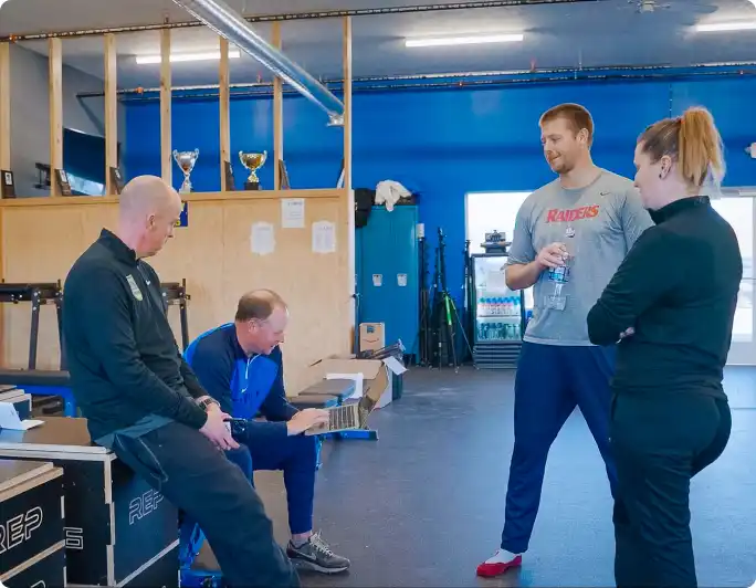
Inclusive and Real Situations
Real people doing real things with relevant surroundings, equipment or expressions. Avoid photography that feels forced.






Iconography
Light and Friendly
When working on marketing materials, leverage the thinner icons as they have a wider breadth of sport specific icons and a friendlier feel.
Product
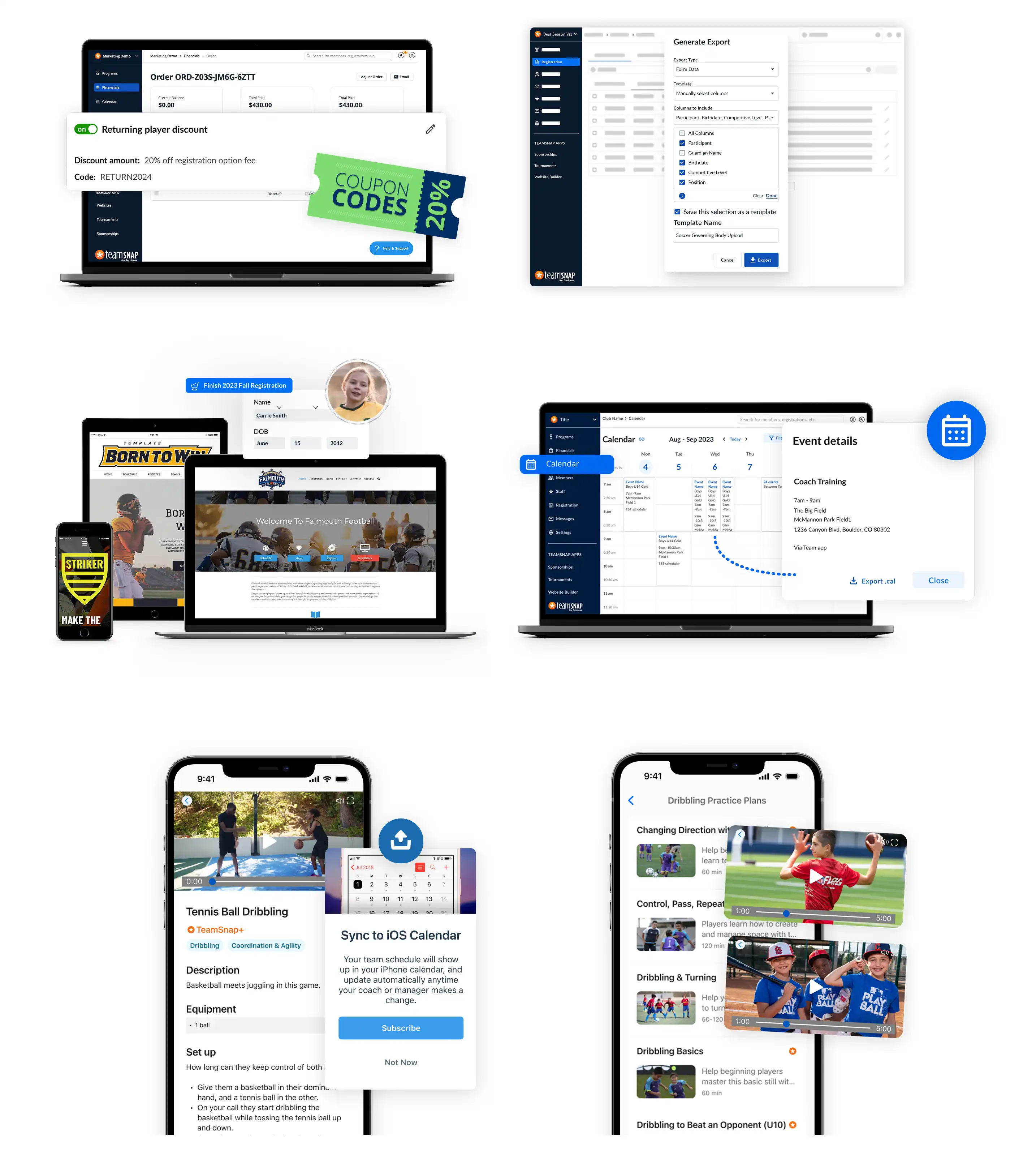
Representing Product and Concepts
Product shots should be a healthy mix of literal (screenshot encased in a device) and creative representations to add a sense of energy while representing the use case fairly.
Download TeamSnap Brand Guidelines
Full TeamSnap Brand Guidelines
Please find below the full version of the TeamSnap Brand Guidelines for your reference.